OUTLINE:
- What is Data Visualization?
- Why Data Visualization?
- Data Visualization tools in Python
- Exploring Datasets with pandas in python
- Introduction to Matplotlib
- What is a line plot and why use it?
- Histograms and their uses?
- Bar charts in Matplotlib
- Vertical Bar Charts
- Horizontal Bar Charts
- Pie Charts in Matplotlib
- Box plots in Matplotlib
- Scatter Plots in Matplotlib
- Seaborn for Data Visualization
- Regression plot
- Violin plot
- Data Visualization using Folium
- Ending Note
______________________________________________________________________________
A Beginners Guide to Data Visualization in Python
A picture is worth a thousand words.
What is Data Visualization in Python?
Data visualization refers to representing information in the form of visuals. Whether you’re using a picture to represent a certain set of information or a mere pie-chart, you’re using data visualization. It can help explain the insights of the data as well as capture the attention of the viewer.
The key aspect of Data Science is storytelling, which makes Data Visualization the Crux of Data Science.
Data Visualization can make your data speak! There is no doubt that when information is represented in the form of a picture like a graph or a chart, it can provide a much better understanding of the Data. Meaningful, effective, and aesthetically pleasing.
Why Data Visualization?
The key skill of a Data Scientist is to tell a compelling story after finding useful patterns and information from data. The plots and graphs can provide a clear description of the data. The Visuals can help support any claims you make based on the Data at hand.
While the more technical results might only be understood by someone certified in data science, visualizations are not limited to data scientists only. They can be understood by any non-technical personnel which is the major advantage offered by them. While doing so, they let us convey most information while being very compact.
Highly Recommended Article: 5 Best Programming Languages for Data Visualizations
Data Visualization is best learned from hands-on practice and exercise, so do not hesitate to perform the examples yourself and tinker with the tools that we are going to dive into, including Matplotlib, Seaborn, folium, and Pandas, etc.
To polish the skills of Data Visualization, we are going to look over practical examples and useful tools to get an understanding of how you can perform Data Visualization in Python!
- Efficiency
- Clarity
- Accuracy
Highly Recommended Articles to Read:
6 Reasons Why Data Visualization is Important in Data Science
Is Data Science Qualitative or Quantitative? (We Find out!)
Data Visualization Tools in Python
Python offers a wide range of tools and libraries for Data Visualization. The libraries can help create interactive, and highly customized charts, graphs, and plots with easy-to-understand commands and functions. Some of these tools that we are going to get a glimpse of in this blog post are very widely used in Data Science.
After this tutorial, you will be able the following list of Python data visualization tools on your own:
- Pandas Visualization
- Matplotlib
- Seaborn
- Folium
- Plotly
However, the main focus of this blog post is Matplotlib as it is the most widely used and efficient tool for Data Visualization in Python.
Exploring Datasets with Pandas in Python
Pandas is an essential data analysis tool for Python. It’s a quick, strong, and feasible open-source manipulation tool. The Pandas website consists of documentation along with a user guide that can help a beginner of data science in learning various features of the Pandas library.
For demonstration of some libraries mentioned above, we are going to look over a few example of code and generate plots and graphs for them. The Dataset we are going to use for this is mentioned below:
Dataset Source: International migration flows to and from selected countries – The 2015 revision.
The dataset is publicly available at the given link. The countries of destination collect the data of the immigrants. The data contains outflows and inflows conferring to the citizenship, Date of birth and place of residence (both next and previous) intended for Nationals and foreigners. The Dataset consists of immigrants from 45 countries.
For this Pandas tutorial, we are going to use the Canadian Immigration Data specifically which can be fetched from here.
So, the first thing that we will do is import the key libraries; Pandas and Numpy.

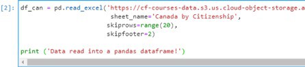
Let’s start by downloading and importing the dataset using the pandas read_excel() method as shown below. But before we do that, we need to download a module that pandas requires to read in excel files
After the Data is successfully read into the Pandas Data frame. We can view the top 5 rows of the data frame using the following command:
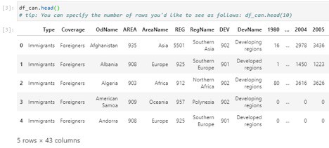
As there are 43 columns, only a few are shown in the screenshot. You can use the sliding bar to view the rest of the Data Columns.
So, this is a short tutorial on how we can visualize our data in form of a Data frame using the Pandas library.
Some other useful functions of Pandas are:
- The bottom 5 rows of the dataset can be viewed using the tail().
- Basic information about the dataset can be fetched using info().
- List of column headers of the data frame can be returned using df.columns.values.
- To get the index and columns as lists, we can use the tolist().
- To view the dimensions of the data frame, we use the ‘df.shape’.
- Drop() can be used to clean the dataset and remove the unnecessary columns as shown below:
- Column names can be reset by passing in a dictionary of new and old names to rename() as shown below:
- Finally, describe() can be used to view a quick summary of each column
This short tutorial of Pandas Library is more than enough for you to load your own Datasets into a Notebook and get your hands dirty with analyzing the data and extracting information from the Data. Now, let’s move on to Matplotlib and other libraries to get a much better understanding of Data Visualization tools in python.
Introduction to Matplotlib
“Matplotlib is a complete library for developing static, animated, and interactive visualizations in Python.” If you are aspiring to create impactful visualization with python, Matplotlib is an essential tool to have at your disposal. It is a low-level library that provides a lot of customizations and freedom to create the kind of visualizations you are looking for.
For Data Visualization, Matplotlib is one of the most commonly used libraries. A lot of development is being done by the Matplotlib team and each new version provides more usability controls for the user. The detailed documentation and tutorials provided by the library are surely a highlight for aspiring Data Scientists.
For the first part of the Matplotlib tutorial, we will demonstrate the Line plots and how you can use Matplotlib to generate them. Some use cases are taken from the IBM course for Data Visualization which can be found here. Without further delay, let’s get started.
What is a line plot and how to use it?
A line plot is known as a graph that uses points or markers for plotting the data. These data points or ‘markers’ are connected by straight lines. It’s a simple type of chart but has a wide variety of applications. Line plots are usually used with continuous sets of data and are very suitable for visualizing data that’s spread over a wide time and is essentially showing some trend.
So, let’s start with a case study from the course I mentioned above:
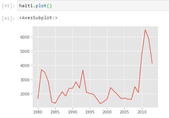
In 2010, Haiti faced a disastrous magnitude 7.0 earthquake. Due to the earthquake, Haiti faced widespread destruction and loss of life; by this natural cause, about three million people were influenced. The government of Canada leveled up to express humanitarian efforts by supporting and welcoming refugees from Haiti.
With the help of a Line plot we can readily visualize their effort:
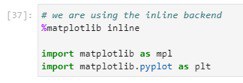
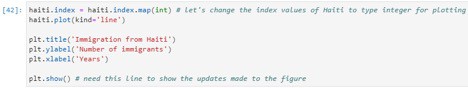
We will begin by importing Matplotlib and Matplotlib.pyplot as shown:
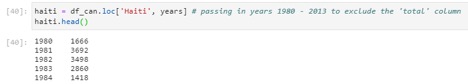
Let’s extract data series for Haiti:
Next, we will graph a line plot by using the command shown
Now let us label the x and y axis as follows:
Running this cell, we get the following output:
From this visualization, we can notice how the number of immigrants from Haiti spiked up from 2010 as Canada stepped up its efforts to accept refugees from Haiti.
Histograms and their uses?
A histogram is a plot that shows the overall distribution of a certain set of Numerical data. It works by creating bins for each frequency class on the x-axis and then according to the frequency of each class, the magnitude of that class is reflected on the other y-axis. For example, if the number of instances in a class is the largest, the corresponding height of that class would be the greatest on the y-axis.
To examine data split, we will use Numpy‘s histogram method to get the bin ranges and frequency counts as follows:
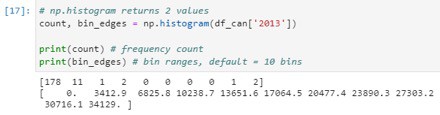
Numpy breaks the histogram into 10 bins by default. The figure below summarizes the bin ranges and the frequency distribution of immigration in 2013. We can see that in 2013:
178 countries contributed between 0 to 3412.9 immigrants
11 countries contributed between 3412.9 to 6825.8 immigrants
1 country contributed between 6285.8 to 10238.7 immigrants, and so on…
We can easily graph this distribution by passing kind=hist to plot().
Running the Above cell plots the histogram shown below:
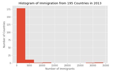
From the above figure, the y-axis represents the No. of countries that contributed to the population range shown along the x-axis. See the pandas documentation for more info here.
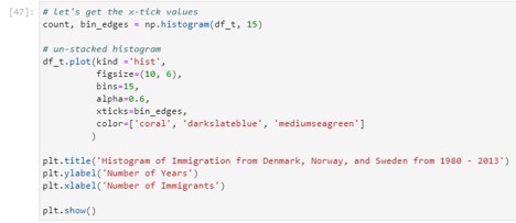
Now we will plot a histogram of the immigration distribution for Denmark, Norway, and Sweden for the years 1980 – 2013. Let us make a few modifications to demonstrate the working and to improve the impact and aesthetics of the previous plot:
- label the x-axis by passing in the x-label parameter
- increase the bin size to 15 by passing in bins parameter
- set transparency to 60% by passing in an alpha parameter
- change the colors of the plots by passing in color parameter
The output of the cell gives the following histogram:
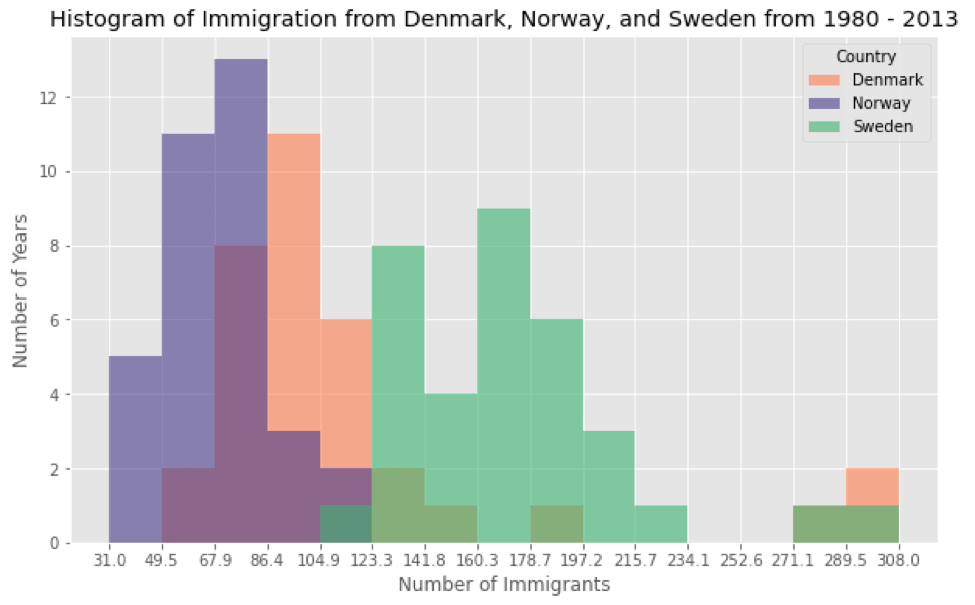
As we can see, the histogram clearly visualizes the number of years plotted against the number of immigrants for each country using a different color. This wipes out many confusions that we might have experienced using a simple histogram. Moreover, can you imagine how easy it is to visualize the information here? And how compact it is to use histogram for such purposes?
Consider if you had to study all this data using the direct sources without using any visualization techniques. You can probably imagine how much of a tiring job it would have been!
Bar charts in Matplotlib
Bar plots are another convenient way to deliver information by using distinctive measured bars. The length of the bars represents the size or the magnitude of the feature. The great thing about them is that they can be used for both categorical and numerical data, unlike other visualization techniques we have seen above.
To make a bar plot, we shall pass argument(s) utilizing the parameter ‘kind’ within the plot() function. This will let us control whether the plot we’re making will be vertical or horizontal. The exact parameters can be seen below:
- Kind = ‘bar’ is used to create a vertical bar plot
- Kind = ‘barh’ is used to create a horizontal bar plot
- Vertical bar plot:
In vertical bar charts, the x-axis is utilized for the titles of data, while the size of bars on the y-axis shows us the magnitude of the variable being measured. Vertical bar graphs are particularly useful in analyzing time series data. However, they’re not useful in the sense that they lack space for text labeling at the foot of each bar.
To get an understanding of the Bar Charts in Matplotlib, we will use an exciting example to perform the task. The task would be to analyze the effect of Iceland’s financial catastrophe:
The 2008 – 2011 Icelandic Budgetary Emergency was an intense financial and political occasion in Iceland. Compared to the estimate of its economy, Iceland’s systemic managing an account collapse was the biggest experienced by any nation in financial history. The emergency driven to serious financial misery in 2008 – 2011 and critical political unrest.
Let us compare the number of Icelandic migrants (nation = ‘Iceland’) to Canada from the year 1980 to 2013:
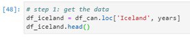
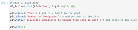
After getting the Data for Iceland in the pandas data frame, we will plot the data using the following lines of code:
The Bar chart as output is shown in the result after running the Cell:
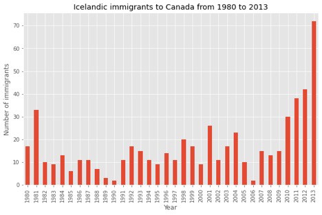
I encourage you to read the Matplotlib documentation for details on annotations: Here.
2. Horizontal Bar Plot:
Sometimes there maybe a scenario where demonstrating data horizontally is considered to be more feasible, especially if you desire for more space for titling the bars in the diagram. In horizontal bar graphs, y-axis is considered for labeling, whereas, the height of bars on the x-axis relates to the magnitutude of the measured variable. There is enough room on the y axis to title multiple variables.
A horizontal Bar graph can also be plotted similarly as shown above. The kind = ’barh’ attribute would differ in this scenario.
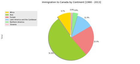
Pie Charts in Matplotlib:
A pie chart is a circle-shaped visual that shows numeric proportions by dividing a circle into appropriate segments. You may have seen these charts being used often in commerce and news. We will make pie charts in Matplotlib in very a similar fashion that we used in plotting bar plots. The only difference is that here, we’ll pass ‘pie’ in the ‘kind’ keyword of the plot function. A sample pie chart is shown below, run on the same dataset.
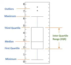
Box Plots in Matplotlib:
Box plots are used for measuring the dispersion of data using 5 main measures. It’s a very useful tool in statistics and tells us a great deal of how much the data is dispersed over a certain range of values. The 5 measures of dispersion are explained below:
- The Smallest number in the dataset excluding the outliers is called the Minimum.
- The Middle number between the median and the minimum is the First Quartile.
- The second Quartile (Median) is the number appearing at the mid of the dataset when the data is sorted.
- The Middle number existing between median and maximum is called Third Quartile.
- The largest number in the dataset excluding the outliers is the Maximum Value.
Scatter Plots in Matplotlib:
Scatter plots basically utilize distinctive markers for diverse datasets and plot them on the same chart.
As a use case from the same case study we used previously, let’s visualize the trend of total immigration to Canada using a scatter plot. We will consider the years 1980-2013. They resemble the degree like line plots since both of them outline independent and subordinate factors on a 2D chart. Scatter plots for the most part are utilized for comparing factors with each other.
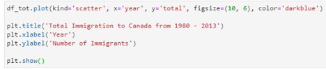
After getting the required data into the data frame and required processing, we run the following code to plot a Scatterplot to visualize the trend of Total immigration to Canada.
The scatter plot generated by the code cell shown above is:
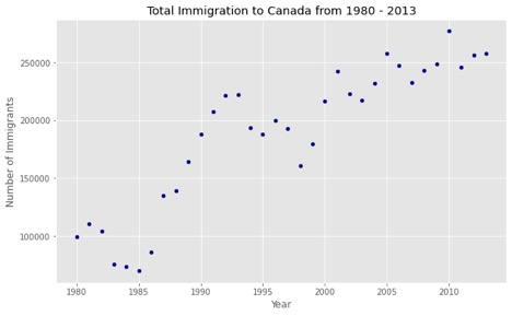
As you can see, a scatter plot does not connect the data points together unlike a line plot. Moreover, as I mentioned before, the scatter plot here is expressing a trend of the rising number of immigrants over the years.
Seaborn for Data Visualization:
Seaborn is a high-level python library used for Data Visualization. Seaborn provides tools and methods to create attractive looking Visuals with a very little amount of code.
Seaborn is a whole package of aesthetically pleasing layouts and designs. You can create an amazing visualization with very minimal lines of code that takes a lot of lines if you use Matplotlib.
Seaborn and other required libraries can be imported by typing the following commands:
- Regression Plot:
We will only look at an example in this blog tutorial for Seaborn and that would be to draw a linear regression model, the example can be found on the seaborn website and we are only using it for demonstration:ss
To visualize a linear relationship resoluted by regression we have to use the two main functions in seaborn. These functions, regplot() and lmplot() are thoroughly related and share much of their core functionality. For this tutorial, we will use the second function:
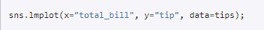
The code generates the following plot:
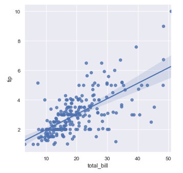
One choice is to include a few irregular commotion called ‘jitter’ to the discrete values to create the dissemination of those values clearer. It is vital to note that the irregular commotion doesn’t alter the relapse line.
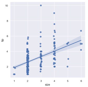
2. Violin Plot:
Violin Plot is another example of types of plot in Seaborn that is like the Box plot we saw in the Matplotlib tutorial. Comparable to the box plot, the initial parameter is the categorical column, the moment parameter is the numeric column and the third parameter is the dataset.
Similarly, there are numerous other options for customization of graphs and plots according to the need and all of them could be found on the Seaborn tutorial documentation on their website. This example is also from the Seaborn website.
So, the reason to use Seaborn is that seaborn is built on top of the Matplotlib library and it offers many progressive and detailed Data Visualization capabilities as we explored above. The library can be used to draw grid plots, Regression plots, matrix plots, distributional and categorial plots, and whatnot. Seaborn is a beast in terms of Data Visualization and makes sure that your data is visualized elegantly with plenty of customizations at your disposal.
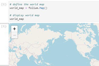
Data Visualization using Folium:
Folium was initially developed for visualizing geospatial data. This tool is a little advanced for the scope of this blog, so we are just going to get a glimpse of this library.
There are other libraries as well that can visualize geospatial data, such as Plotly, however, they might come with a few restrictions such as having a limit of API calls. On the other hand, Folium comes packed with quite a few built-in tilesets from Stamen, OpenStreetMap, Mapbox. More so, It supports custom tilesets as well.
After installing and importing Folium, running the following code cell shows the world map as the output which can be zoomed in or out and displays geospatial data in a very easy to understand way.
Ending Note:
With all the libraries and tools at hand, it gets quite confusing on which tool one should use to create the perfect Data Visualizations. The answer to this is quite simple and predictable; go for the easiest option according to your need. If you have come this far on this blog tutorial, you must have a good understanding of what kind of functionalities each library offers.
At the end of the day, the goal of this blog tutorial is to make sure you become proficient with Data Visualization. It is up to you now to further enhance your Data Visualization skills by diving deeper into each library and performing different tasks and exploring different methods. Feel free to practice as much as you can and get help from the documentation on the websites of each library/tool as mentioned in the blog.
Recommended Article: 7 Tips to Make Data Visualization EASY
