Data visualization is what taps our minds first when it comes to data analysis and its essence, especially in the 21st century. While we are generating a massive amount of data every second, data visualization is what makes all this data ‘speak’. Without an effective way of visualizing data, there’s no denying the fact that the majority of this would turn out to be useless.
With that being said, data visualization isn’t some concrete process that has a predefined pattern that could be used every time some kind of data needs analysis. Rather, it’s a creative process supported differently by the underlying language we use to apply it.
Several languages enable us to perform high-quality data analysis revealing amazing trends and patterns. But how do we choose one language over another? How do we know what is the best language to use for data visualization?
While R may be better for some sort of mathematical or statistical work, it’s pretty safe to say that Python is by far the best programming language for data visualization in today’s era. Having a wide variety of libraries, it’s great for general purpose data visualization and there’s no second thought to this.
We will go through this in detail in this article. Hopefully, by the end of the article, you will be confident about what language you should use for data visualization.
What is Data Visualization?
Data visualization is a mere term given to the process of representing data graphically. In contrast to the conventional ways of representing data, such as in the form of text, we use graphs and images to make the trends stand out and be readily visible.
Data visualization makes it easier to spot minor details in huge amounts of data and makes it more appealing to our eyes since graphical representation is naturally more appealing and tells stories a lot more precisely.
Which Programming Language is Best for Data Visualization?
While skilled personnel in industries have a mixed range of opinions, there are two major competitors for whom the spot for the best programming language for data visualization is up for grabs; namely, Python and R.
The competition isn’t easy. With data visualization being the most important tool to get your hands on all the data you need and using it to your advantage, more and more languages are offering tools and technologies to make it easier.
Highly Recommend Articles:
10 Best Data Visualization Libraries in Python
Top 15 Types of Data Visualization Explained
Top Programming Languages for Data Visualization
While we have already established the fact that Python beats its competitors when it comes to general-purpose data visualization, let’s dive into some specifics and see why that’s the case.
Moreover, there are some other programming languages as well that might be more suitable to people looking for some specific goals. Let’s see.
R
You might know R as the best statistical language for a data scientist. Well, that’s true. R is no less than an undefeated champion when it comes to great support for different mathematical and statistical programming.
As a matter of fact, R dominated Python clearly with an overwhelming figure of 81.9% when it came to statistical modeling, according to the results of a survey.
R programming language is a very creative and intuitive programming language. Since it is mainly focused on statistical processing and extracting trends from data, it has the support to create very high-quality visualization with a few lines of code.
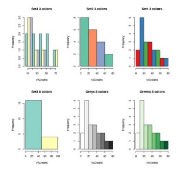
R is beginner-friendly when it comes to making straight-forward visualizations such as histograms, bar charts, box plots. However, if you want to jump on the higher level, it’s got great support for that as well; There are various other advanced-level visualizations offered as well such as:
- Heatmaps
- 3D Maps
- Mosaic Maps
And so on.
Tip: If you’re a beginner and want to learn data visualization in R, you can use a library called HistData. It’s a package that provides a wide collection of dummy datasets to practice your data visualization skills.
One of the best things about R is that it comes pre-packed with built-in datasets that you could easily use for practice purposes. Not only does this relieve you of finding and importing different dummy datasets for basic practice, but it also saves you a lot of time and makes your practice very efficient.
To load a built-in dataset, you just have to write a simple command of data, followed by the name of the dataset inside braces. That’s how simple it is!

Once you have imported the dataset like this, you could easily apply any visualization function you wish to try on it.
Data Visualization Packages in R
Now, let’s jump on to some cool packages in R that you could use for data visualization. You can easily use them as a beginner as well as an intermediate.
- Colourpicker
If you’re looking to pick shiny colors for use in plots, look no further. This package in R is an amazing framework that supports a lot of customizations; use of colour palettes, opacity, and transparency, to name a few.
- ggplot2
ggplot2 is amongst the most popular packages in R and is used by a lot of professionals out there. The special thing about this package is that it can build graphs very conveniently, no matter what kind of dataset you have. You can build any kind of plots with it, whether your data is univariate, multivariate numerical, or even categorical.
So, if you’re looking to make intricate plots easily, this is the way to go!
- Esquisse
If you want to make your plots made with ggplot2 interactive, Esquisse is the package you need. All you would need to do is drag and drop the components to map them. Once you are done with making them interactive, you can easily export them to formats such as ‘.png’ or ‘pptx’.
Python
Python is known as being the best general-purpose programming language for data visualization. You need very minimal knowledge of programming to visualize data using Python. So, whether you’re a statistician or a teacher who’s not into programming, you won’t face a hard time with Python.
Highly Recommended Article: A Beginners Guide to Data Visualization in Python
Another great thing about Python is that it has a huge lot of libraries and packages to help you do your job quickly. The syntax is minimal and intuitive, while the huge community makes things even better.
Talking about the libraries you could use, there are so many available that sometimes one could get confused about what to use. Some basic ones could be used to do beginner visualizations, but if you want to make things fancier, there are always add-ons available such as Seaborn.
Here’s a list of some of the most popular libraries you could use for your everyday visualizations.
- Matplotlib
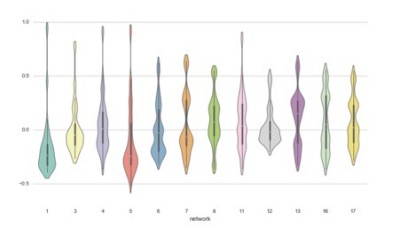
Matplotlib is undoubtedly the most used library in Python being used for visualizing data right now. Even though it does not support very fancy plots such as the one shown above, it has everything you would need as a basic, from basics to highly interactive plots.
However, this doesn’t mean matplotlib lacks functionality. The default themes are basic and they’re mostly aimed at plotting basic charts and figures such as bar charts, histograms, line plots, and so on. But if one wishes, it can be tweaked for advanced plotting also.
Matplotlib can be easily installed using the pip command. Once the package is installed, you can simply import the library into your notebook and start using it.

- Seaborn
Coming at the second most useful Python library for data visualization, we have Seaborn. Not only does Seaborn provide a very fancy set of plots to use, but it also comes with high-level interfaces and great default themes. The plots made with it are very appealing and pleasing to the eye.
The best thing about Seaborn is that it makes plotting as easy as it is to blink your eye. The same plots that would have spanned over multiple lines in matplotlib can be made using a single code line.
Just like matplotlib, seaborn can also be conveniently installed using the pip command, and you can start using it immediately.

- plotly
Finally, plotly is another very useful Python library for data visualization if you’re specifically looking for interactive plots. The quality of plots made using this library are high-quality and are publication-worthy.
It’s an open-source library with a vast range of interactive plots, ranging from basic charts to as far as financial or even 3D maps. So, there’s a lot to gain from this specific library, especially if you’re doing some commercial work.
You can install plotly using the pip command and then import different components in your notebook according to what you need.
Here’s a sample line graph I made using Plotly.
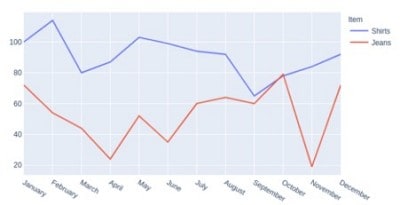
Of course, you would need context to put this graph into perspective, but it’s just a demo. Further, the graphs can also be made interactive for other people to use them. If you want to learn more about how to make these plots interactive, don’t hesitate to take an in-depth look here.
That’s not all; Plotly has a lot more to offer, including a wide variety of themes, surface charts, and so on.
JavaScript
JavaScript is not as well-known for data visualization as the above two programming languages. Nevertheless, it also comes packed with some top-notch libraries that one can use for pretty amazing data visualizations.
Suppose you’re building something using JavaScript, a web page, for example, and don’t want to use a Python environment separately just for the sake of visualizations. In that case, this is the way to go. All you need to know is a bunch of JS libraries that will help you throughout your journey.
Here’s a list of some amazing libraries you could employ for data visualization using JavaScript.
- D3.js
D3 is by far the most popular library amongst JavaScript developers for data visualization. On top of visualizations, it offers more features, such as data analysis, geo, and other utilities. The underlying framework uses basic HTML, CSS, and SVG. Surprisingly, the API is humongous, and if one takes a look at it, it’s hard to figure out it’s meant only for data visualization.
While there are many advantages of using this library and there’s hardly anything you cannot achieve using this, there are some cons associated with it. Amongst these cons, the first one is rather unsurprising; the learning curve. Since it’s a JS library, I don’t find this unusual.
To get used to this library and be able to use it smoothly, you will have to pool in a considerable amount of time. Also, there’s huge documentation you would often need to go through when you’re implementing anything using it.
Also, you would need to grasp the concept of basic JS concepts such as the use of DOM, which might not be easy if you’re not a computer person.
- Chart.js
ChartJS is another open-source library which is quite famous amongst developers looking to plot basic plots. If you’re looking to make your website responsive using canvas elements, this is the way to go. It comes packed with beautiful animations and supports the basic eight chart types, including bar plots, line plots, and so on.
However, it’s meant for beginners with basic charts, so if you’re looking for advanced features, this might not be your best pick. While you can combine other libraries to add more features to it, I’d say you choose something else altogether.
- Victory.js
VictoryJS is specially designed for modular charting and comes with special support for ReactJS and React Native. The working of the library is easy, with a good learning curve. If you’re a beginner with good basic concepts of JavaScript, you should find this library pretty useful.
Also, since it supports React Native, it could be a pretty good option if you’re into building cross-platform apps. So, make sure you check it out here.
Which Programming Language Should I Use for Data Visualization?
It’s important to note that there is no universally best programming language for data visualization. Although the majority of experts will lean towards Python for general purpose, before you opt for any language, there are certain questions you should ask yourself, if you want to make the most effective decision for yourself.
- What kind of data visualizations do you want to make?
- What dataset do you have?
- What’s your level of programming skills?
- What level of customizability do you want?
- The learning curve of the language.
Once you answer these questions, choosing the right programming language will become quite easy for you.
Takeaway
Data visualization is a vital part of data analysis and plays a key role when you have a lot of data at hand. Since the data available nowadays is abundant, it’s important we utilize good data visualizations to make the best use of the data available.
However, once you decide to visualize data, one of the biggest obstacles is which programming language to use. While there are many languages out there that support data visualization, not all are the best for any purpose.
We saw some of the best programming languages you can use for effective data visualization throughout this article. We went through the most valuable libraries for each language and saw what features set them apart and when you should use them.
